CHARACTER DESIGN FOR VIDEO GAMES
Last Updated: 06 Dec 2022
Introduction
As part of my Coursera course with California Institute of The Arts. This course was part of a broader Game Design: Art & Concepts specialisation, which I have completed as well.
Week 1: One Character, Three Ways
The following concepts were covered in this week's lesson: Density, Mood and Story, Proportion. And I was to variate a character design to reflect these concepts.

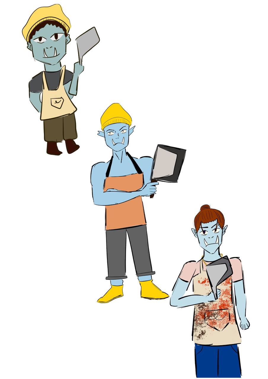
The character I chose is Thor, a half-orc butcher.
The first design has a drab colour scheme and is chibi in proportion. A drab colour scheme suggests a darker mood and since the character is smaller in size, less details can be added to the character. The second design has a brighter colour palette and more realistic proportions. The brighter colour palette lifts the mood. The third design has more details (higher density), making it more obvious that the character is a butcher.
Week 2: Opposites Attract
This week I was to design two characters who are polar opposites.
The sun is a woman, and her skin is marked with sunspots and her hair is fire. Her demeanour is cold and harsh. Her dress is red as the sun gets older, it becomes redder.
The moon is a boy, small and a child. With a very dull color palette, other than the rain coat which is yellow because the moon chose it to mimic the sun. He is standing in a puddle to indicate that he controls the tides. He has grey skin and slightly brighter blue hair. At first glance, you can't tell that the child is the moon because as part of the story -- he aspires to be someone else. Hence, it isnt clear as to what he looks like. As time goes on, the child will eventually have a design that reflects himself.
In the context of the game, the moon aspires to be like the sun and frequently approaches the sun. However, the sun being older is aware that the moon can't become the sun - as it is a rock whereas the sun is the star. The sun constanly rebuffs the moon and keeps him at arm's length so as to not eventually break the moon's heart when he realises it is impossible.
They are meant to be foils of each other, such that the moon will eventually realise that he is special in his own way. For example, typically the sun is viewed as harsh and too hot in the desert while the moon is a welcome sight for it is cooling and beautiful. He also realises that his ability to control the tides is something unique to himself and benefits others.
Week 3: Observe and Adapt
This challenge was to examine and consider the characteristics of existing characters and styles that I found inspiring and adapt them to different styles.
The goal was to discover what makes characters recognizable and unique, and how changing certain elements can make them fit into a new world.
The first two pictures are from the Danny Phantom Wiki, and the third picture is from the Danganronpa wiki.
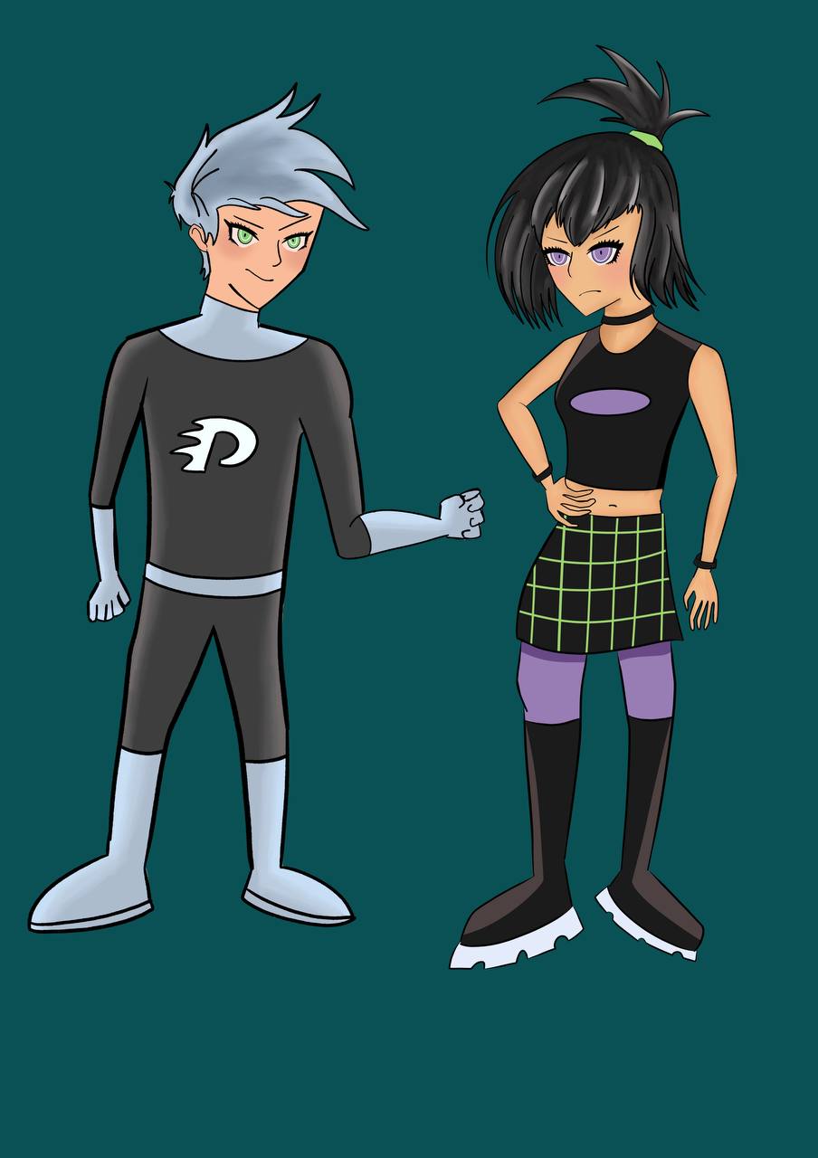
The characters I chose were Danny Phantom and Sam Manson from Danny Phantom. It is a children's cartoon - hence the character design is simple but iconic. The colour palette used is limited, and shading is done as block shading. The character body proportions are also less realistic for the sake exaggeration.
I chose the game series Danganronpa, as it is a direct contrast from Danny Phantom. Danganronpa is a dark game that takes place in a dystopian world. This game uses an anime style, featuring exaggerated hairstyles, soft and blended shading and thick lineart. The colors used in this game are also darker. The characters also have blush on their face.

When adapting the characters into the Danganronpa style, I chose to keep the color palette the same. As both the characters used are already wearing dark colours with some bright accents, I felt that they fit in with the danganronpa world, palette wise. As for shading, I attempted to do soft and blended shading. Cartoons often have very simple body designs / anatomy compared to anime styles which tends to be more realistic when compared to cartoons. Hence, I attempted a more realistic body shape for both. I also gave them exaggerated hairstyles and eyes that follow the DanganRonpa style.
Week 4: Outside Inspiration
This challenge was about taking inspiration from a common household item and designing characters based off that item.

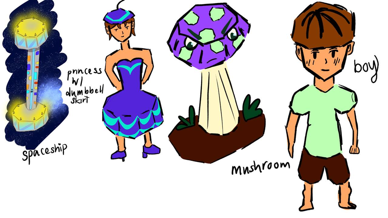
These designs are based off a purple dumbbell. The spaceship is clearly dumbbell shaped. For the rest of the characters, I began by thinking which specific features can resemble a dumbbell, rather than having the design be dumbbell shaped.
Hence, the second character has a hexagonal hat and a puffy dumbbell shaped skirt. A mushroom cap can also resemble a dumbbell shape which was used for the third character design. In the last character design, the bowl hair cut and the shorts and sleeves are to resemble a dumbbell's hexagonal shape.